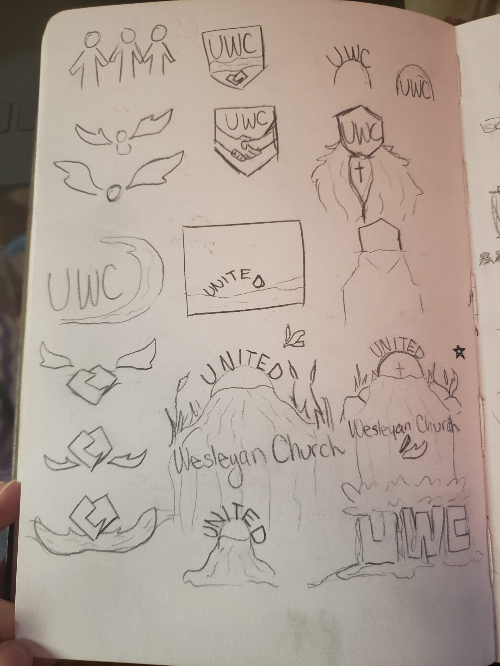
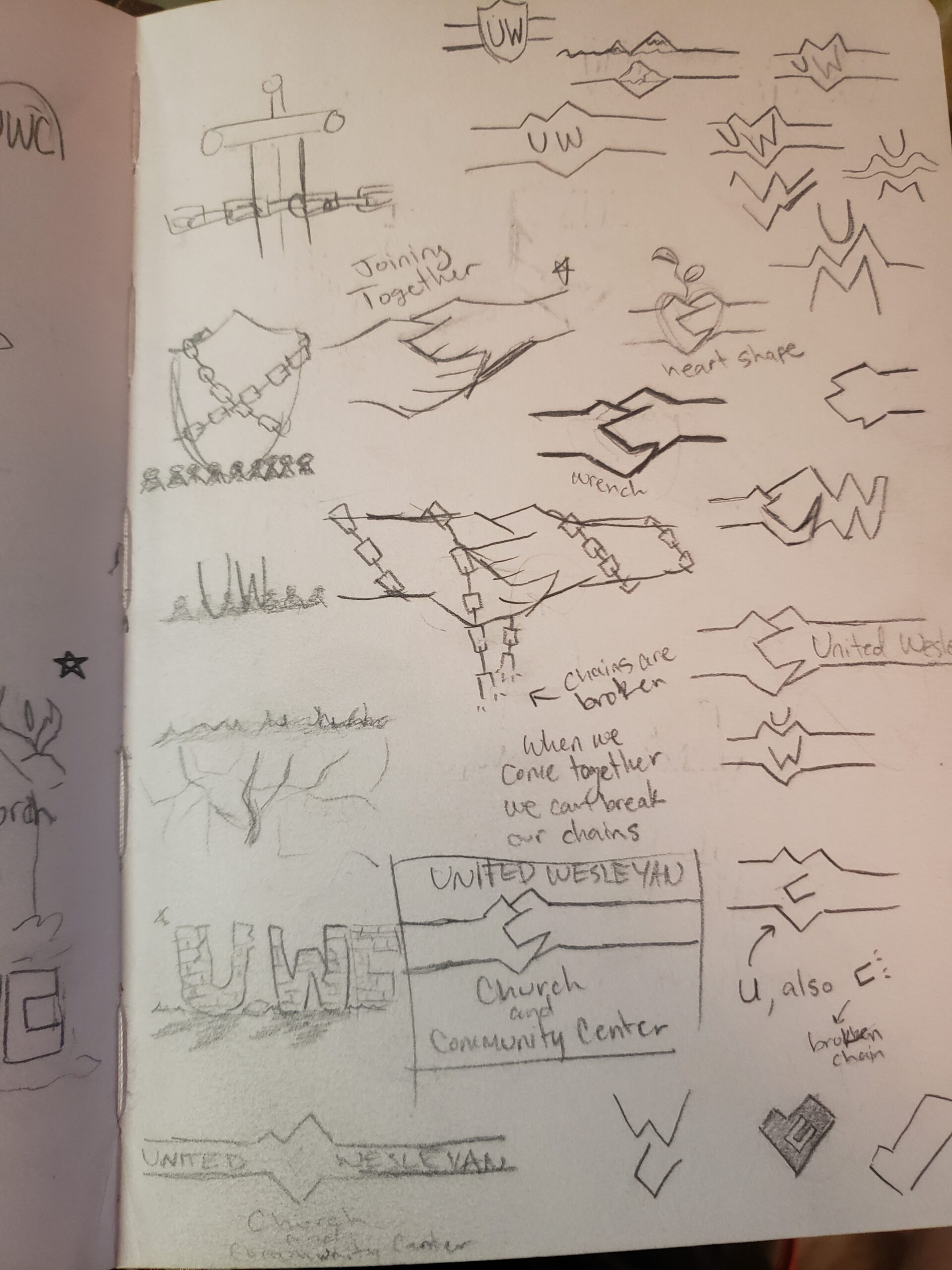
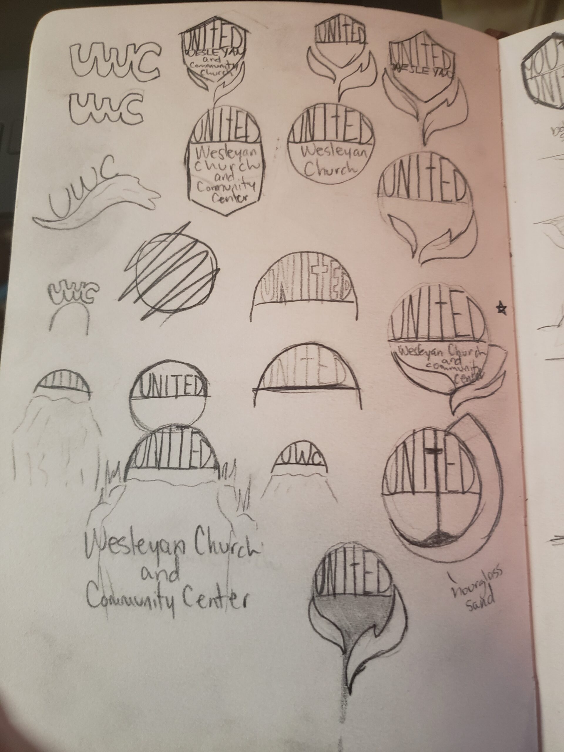
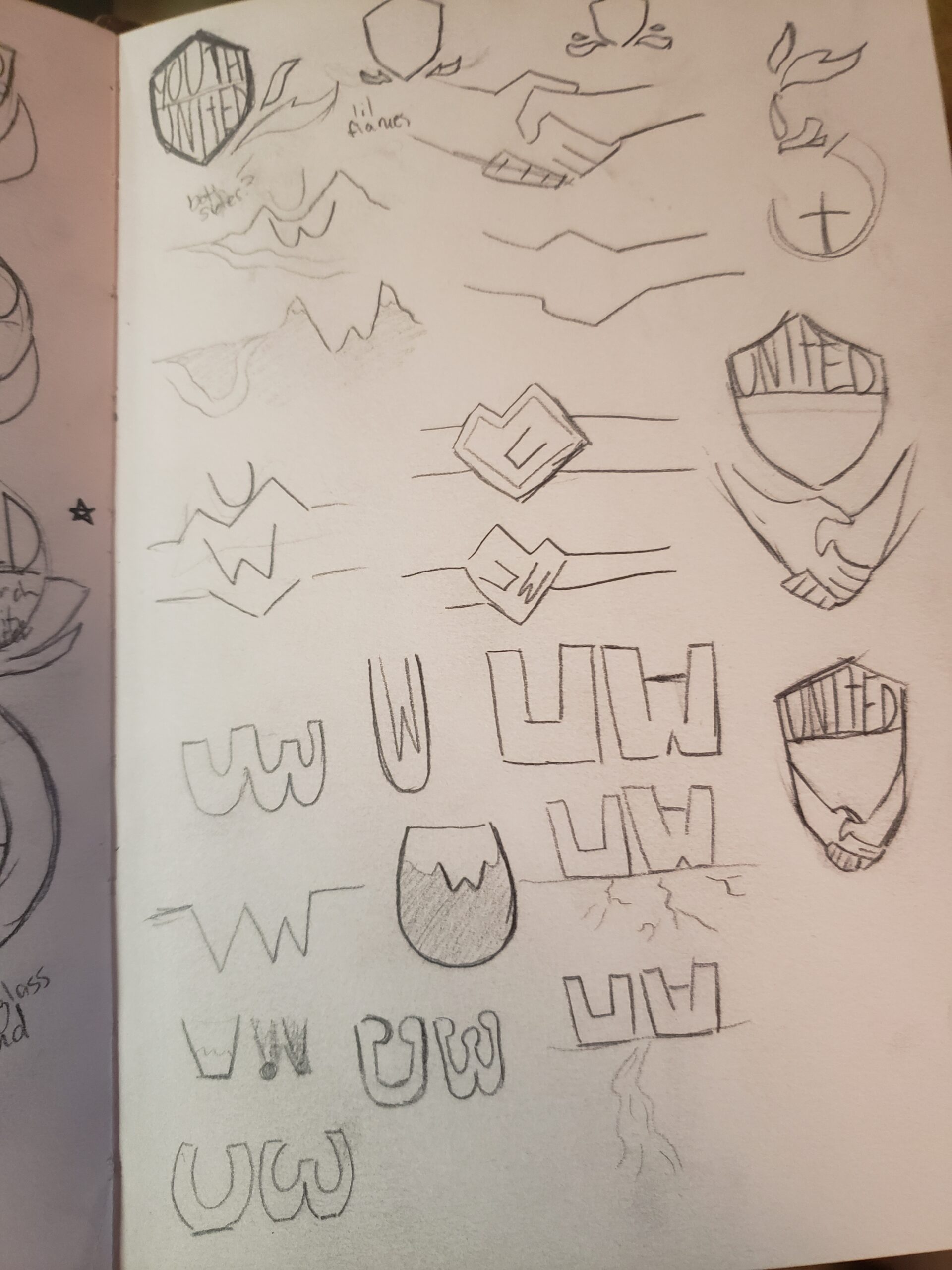
Logo for Sandy Creek United Wesleyan Church and Community Center
I wanted the logo to be connected to the name of the town the church is in “Sandy Creek”. I also wanted the name “United” to have meaning in the logo. Eventually, after much sketching, I came to the idea of a bridge that not only spans a stretch of water like a creek but also is a means of connecting others. The word “United” in the logo resembles a small arched bridge and the circular shape of it keeps with the idea of unitedness and connectedness. The dove shape- which has been slightly skewed from its originality to fit with the rest of the image- is reflective of the Wesleyan Church logo, which my client wanted so that it could be easily identified
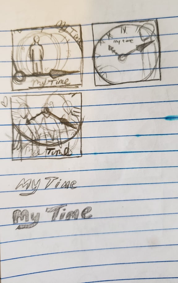
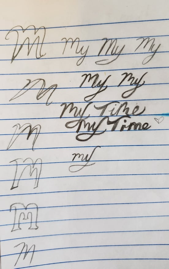
My Time
“My Time” is an album cover design I did in photoshop for the Korean singer Jungkook of the band BTS. Jungkook’s song “My Time” is about his experience of becoming famous very young. He was only 14 at the time of the band’s debut. He has sacrificed many things in order to gain popularity for himself and the band. The main sacrifice is his relationships with people outside of BTS. He sings, “I can’t call you… I can’t touch you…” He was so busy with his work as a kpop idol that he never had time to keep in contact with others. He is also out of touch with his friends’ experiences because he went on to grow up in the spotlight. He can’t relate to his old friends anymore so he is sad.
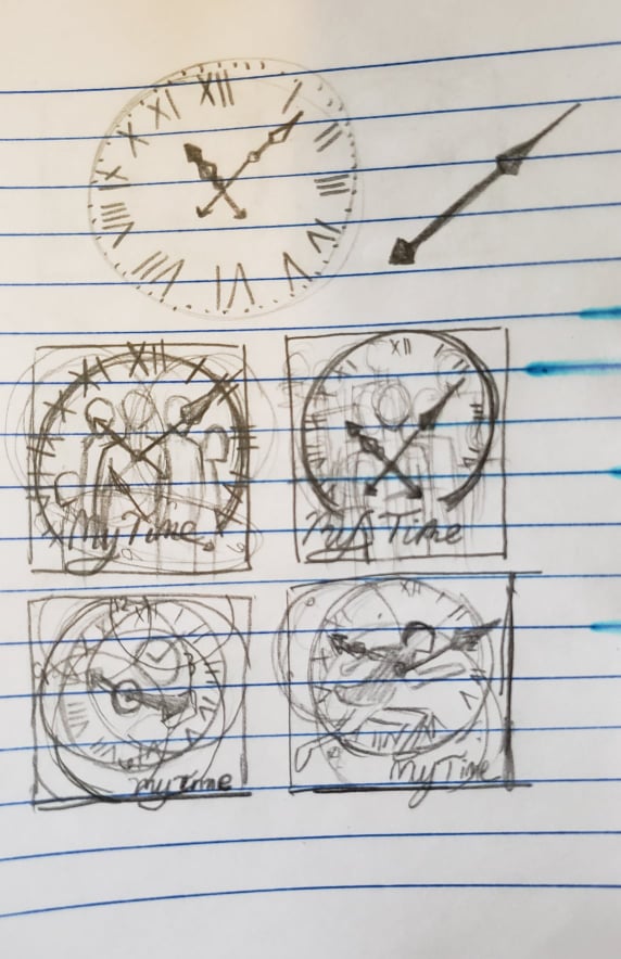
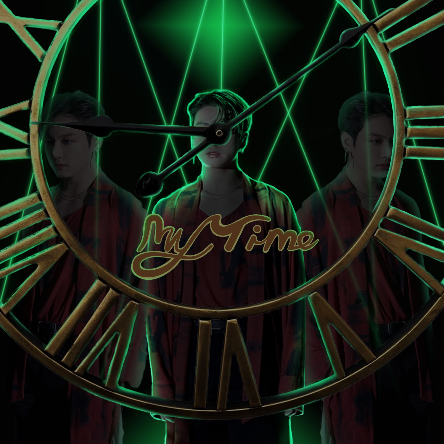
I edited photos of Jungkook on either side of him, making him appear transparent. They are meant to symbolize his past self and future self which are both unattainable and ever-present. Jungkook lements his regrets pertaining to his future and his past self. He sings “Am I livin’ this right?”
At the end of the song, the chorus changes slightly into something more positive. He sings, “I will call you. I will touch you.” It’s like he’s dedicating himself to the people he cares about, vowing to make time for them and reconnect with the old friends he left behind. This song is one of my favorites because I relate to it so deeply. I can’t relate to his fame, but I know the regret of becoming out of touch with the people you love most because of the distractions and hurry of life.
The text, which I made in Adobe Illustrator, is stylized so it looks fancy and poppy, attributing to his wealth and music genre. The green lasers are a nod to Jungkook’s stage performance of the song. The golden roman numeral clock is fancy and prominent because of the song title. I made the environment dark and empty like he is standing in a void because the overall vibe of the song is loneliness. Jungkook’s face is covered with the clock’s hands to show his inability to slow down long enough to pay time to those he has become disconnected with.
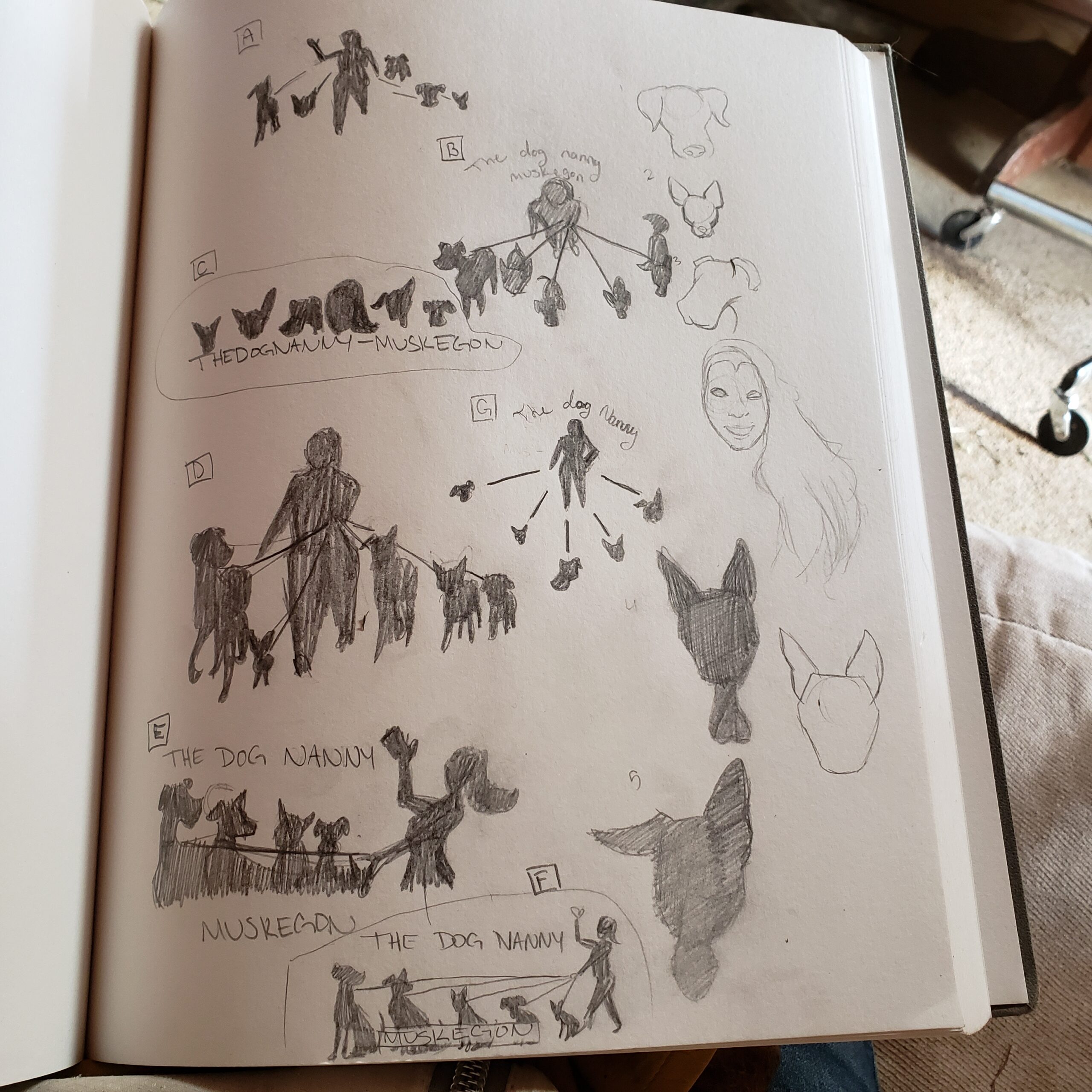
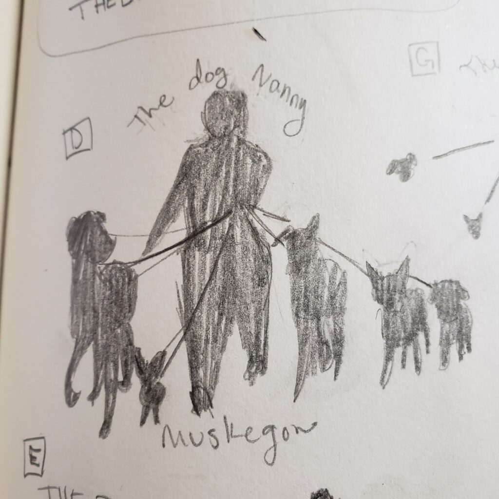
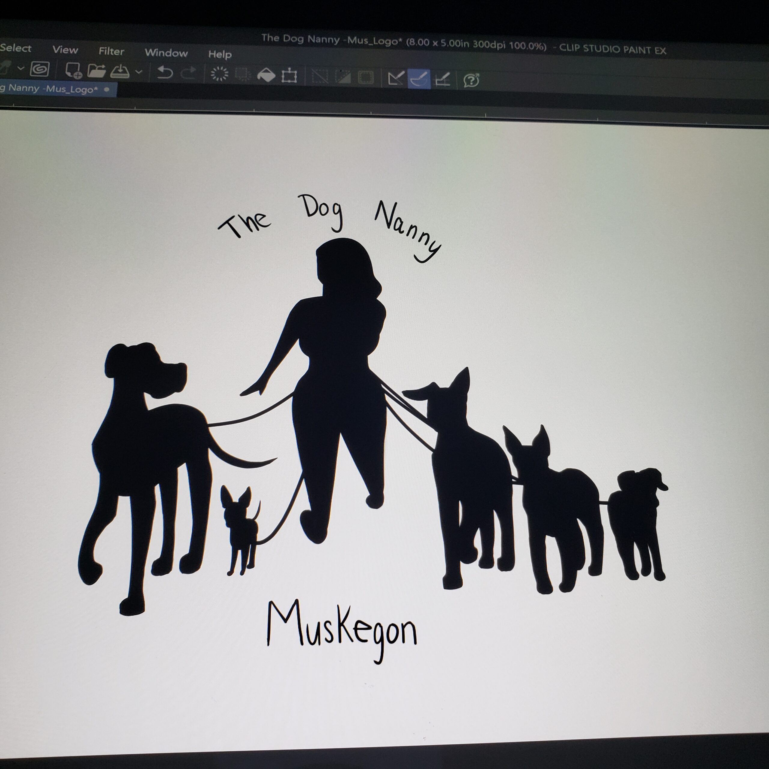
Logo For a Doggy Daycare Facility
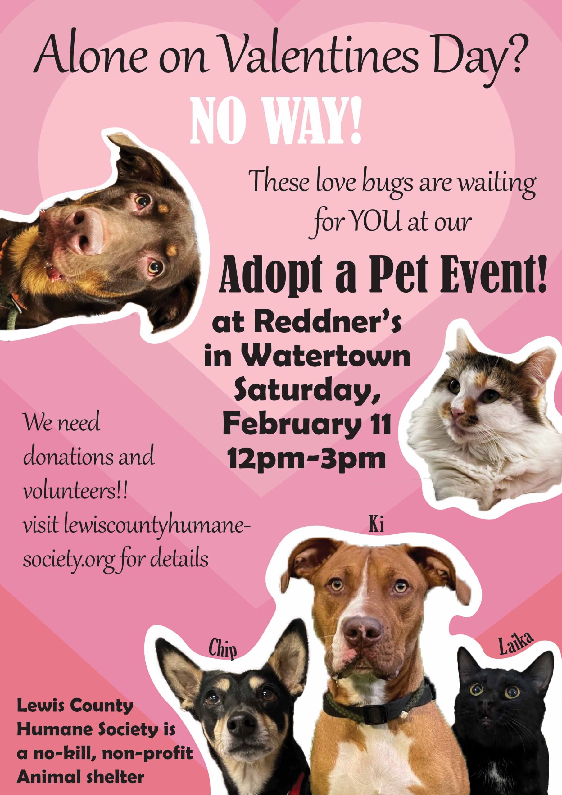
Pet Adoption Flyer
I made a flyer in Photoshop for a real animal shelter with a valentines day theme.
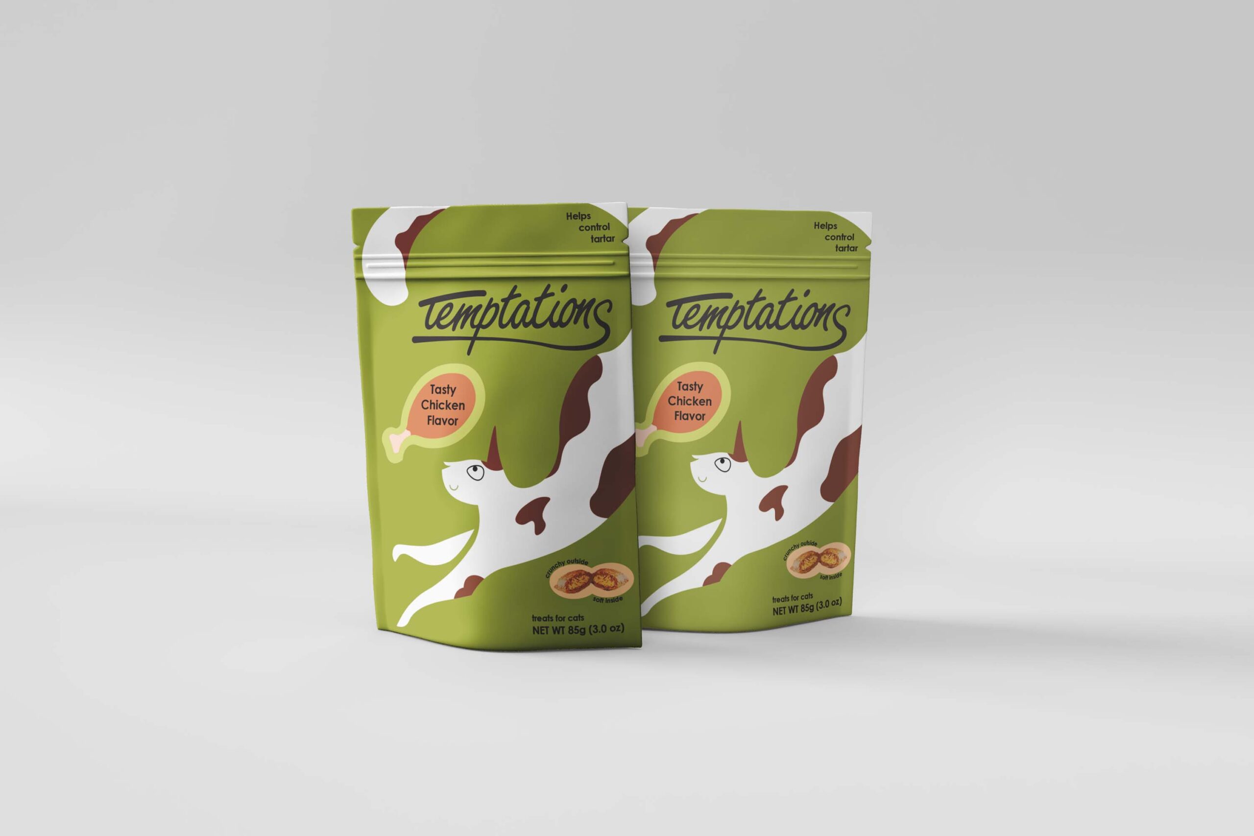
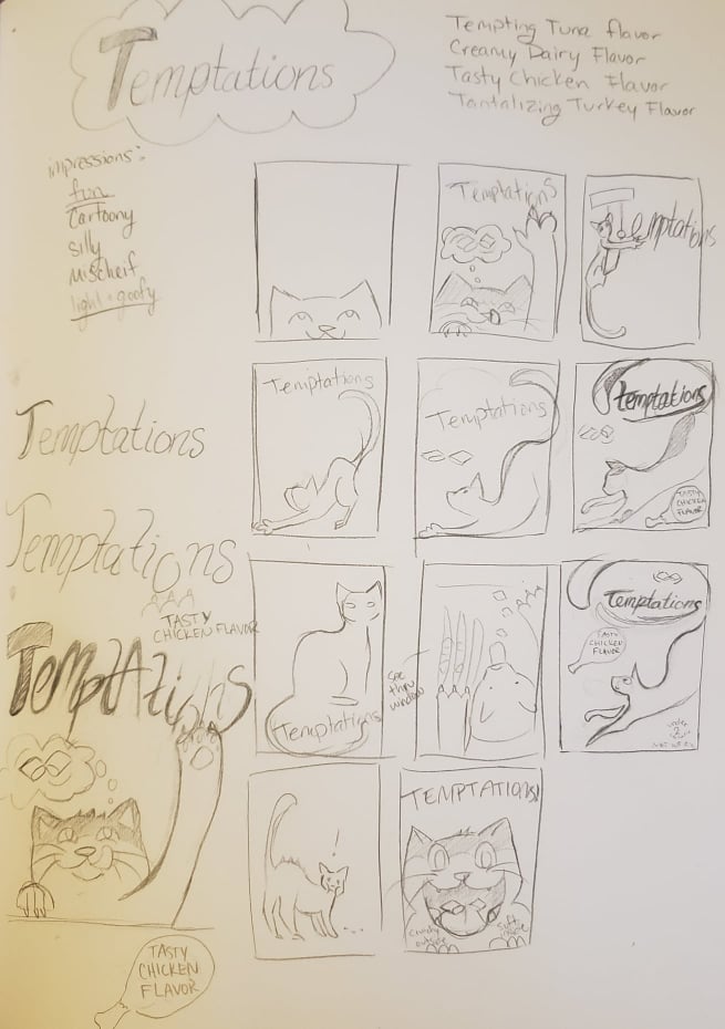
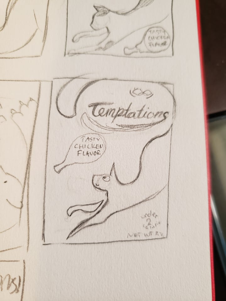
Temptations Rebrand
I wanted to challenge myself to create a rebrand for an existing product. The product is Temptations cat treats which my cat is obsessed with. First I made some thumbnails to decide what I wanted the new packaging to look like.
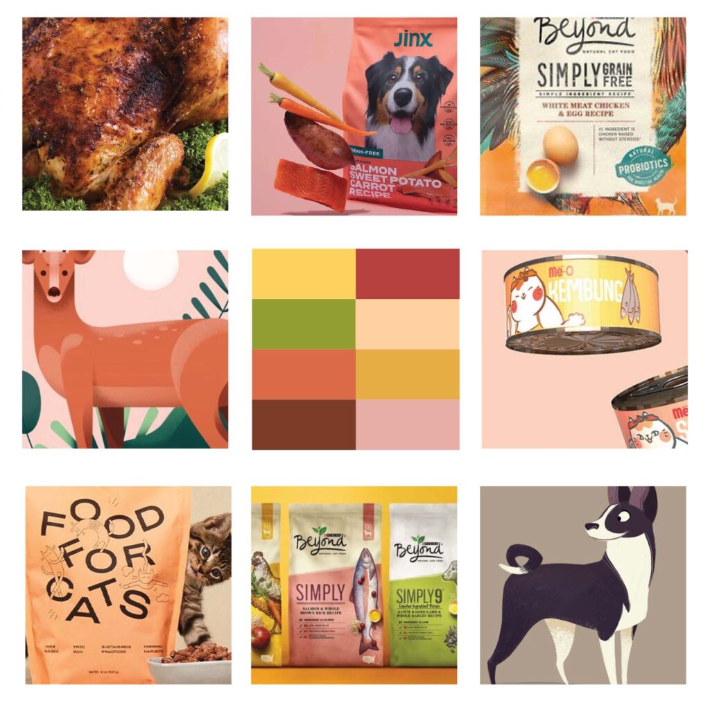
Second, I did some research and created a mood board that I could reference as I made the final artwork for the packaging. I think in my future projects, the mood board should be the first step so I can refer to it in my thumbnails also. (I did make a few new thumbnails after making the mood board so that it would match the vibe I wanted better. It was one of these I chose when moving on to my final design.)
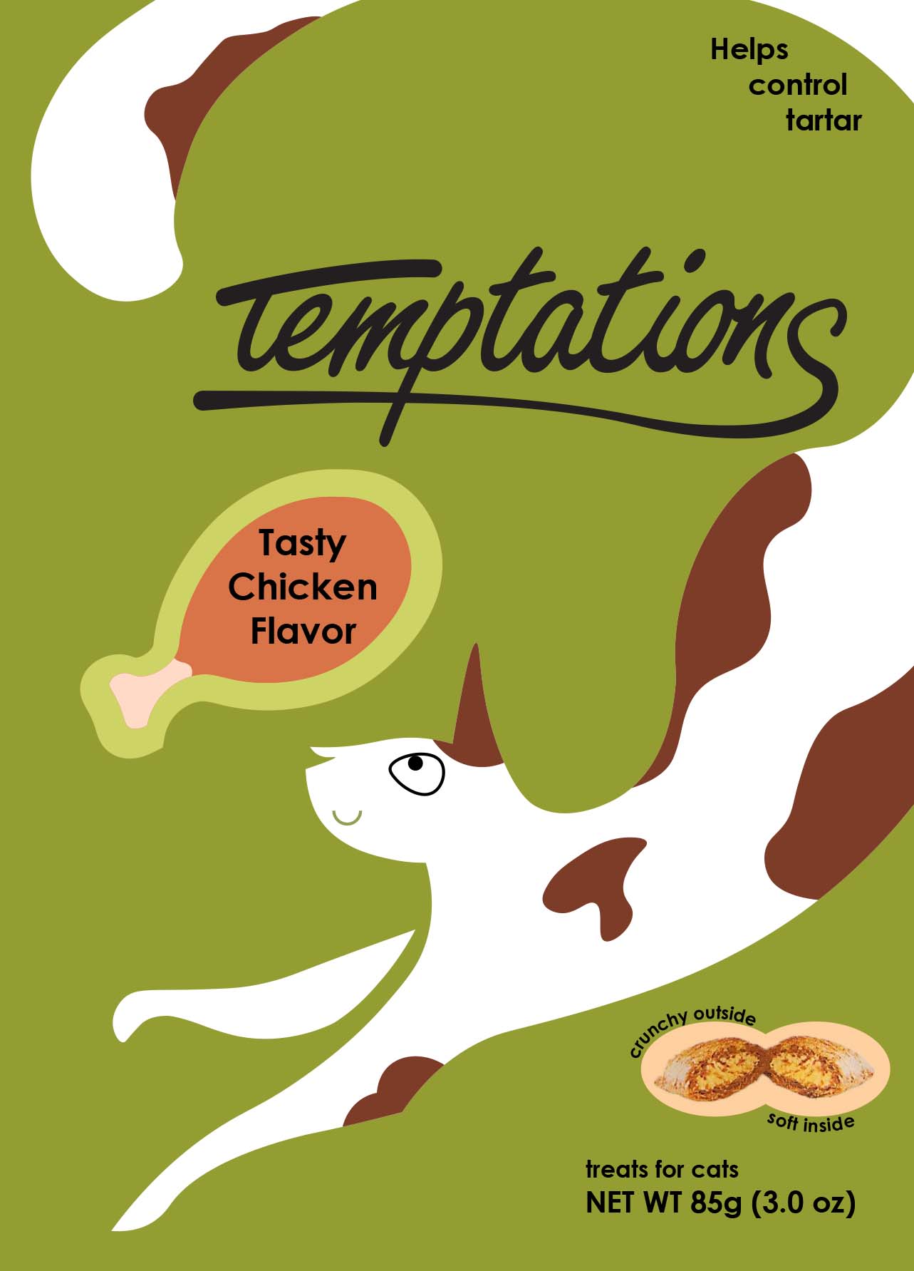
Final Design
I chose green as the main color along with some other muted colors because I wanted a more natural, simplistic look in order to follow the trend of pet foods advertising natural ingredients. Temptations is already a well-known cat treat brand and so I wanted to keep the same cat as its mascot. I also wanted to keep some of the goofy vibe from the original packaging, but make it classy, so I went with a clean, no-line illustration with lots of curviness and a cartoon face to bring in that whimsy. I designed the name so that it wasn’t so different from the original that you couldn’t tell that’s what it had come from, but different enough that it felt fresh.
Product Packaging Mockup